Here is the final batch of maps for the #30DayMapChallenge. The first ten maps are here. The second installment here.
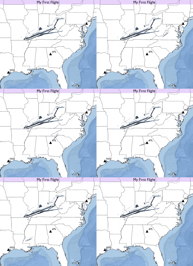
Day 20 – Theme: Movement
The first plane trip I ever took. PHL to HOU with an hour layover in Atlanta.
Day 21 – Theme: Elevation
I learned that you can make quick elevation profiles using Google Earth Pro and was curious what the Finger Lakes, some of which are very deep, would look like. Most of the work was in annotating the hills and valleys.
Day 22 – Theme: Boundaries
At my day job I was asked to emulate a project from the City of Columbus. When I first encountered that crazy boundary I didn’t know what I was looking at but here it is. Many cities such as Detroit and Los Angeles surround well known enclaves but I’ve never seen anything close to this. Had some fun with the magnifying glass on the locator map.
Day 23 – Theme: Data Challenge 3: Global Human Settlement Layers (GHSL)
Like many, I was completely unfamiliar with this data set. I still don’t know much about it but I downloaded their built-up areas and drew them as if they were elevation, hills being the settled areas. I looked around for a good pattern and found Quebec City. In retrospect, I could have done a better job lightening the greys and changing the elevation quotient but there’s only so much time in a 30-day challenge. I played around with some additional data layers in GIMP to create this image.
Day 24 – Theme: Historical Map
I did some recent tutorials on how to create a historic looking map in GIS software. The least historic place I could think of was Las Vegas. I got the buildings layer from the City of Las Vegas upon which I discovered that the main strip (including the casinos) is not even in the city but rather in Paradise, Nevada. Unable to find their buildings, I drew my own. I added an ad for wagon lumber. The text was inspired by other maps from that era. The title block was taken from a map of Las Vegas, New Mexico via the Library of Congress. Some image manipulation was used to change “N.M.” to “NV” and the elevation from 6,400 feet to 2,000.
Day 25 – Theme: Interactive Map
I enjoy hockey so I was curious about the world’s second major league, Russia’s KHL. Without reinventing the wheel, I made a similar interactive map to my previous ones of transit tokens and for New Year’s Eve. Wikipedia was extremely helpful for providing both an already usable data set and the team logos. Above is just a screen shot. The interactive map can be seen here.
Day 26 – Theme: Choropleth Map
For anyone that doesn’t know the jargon, a choropleth is a map with areas colored based on data. In this case I tried my hand at a bivariate (two data variables) choropleth. This was based on a Tweet from the European Commission showing the relationship between COVID-19 vaccination rates and death rates. These maps can be hard to follow but the expected pattern should be yellow (low death rates, high vaccinations rates) to dark blue (opposite). The lack of red or orange shows that countries with high vaccination rates do not have high death rates. The confusion of the map is compounded by needing to flip the legend so that the high vaccination rates are at the bottom of the legend.
Day 27 – Theme: Heat Map
It took 27 days but I finally thought to reuse a data set and made a heat map of Day 25’s KHL data. I did not love the look of the original map (below) so I tried to hand draw it. It looks sort of nice but I misplaced the Moscow area and had to make up for it by adjusting some of the other locations. Here is the original computer generated version.
Day 28 – Theme: The World is not Flat.
Once again working with the KHL data I tried my hand at a spherical map projection. This data is good for this because of the impressive longitudinal reach of the league. Those players do some long traveling!
Day 29 – Theme: NULL
Going back to the theme from Day 26, I noticed that certain countries routinely had null data values for their vaccinations. Here they are.
Day 30 – Theme: Metamapping Day
I thought it would be fun to use this theme to show the locations and software used for my other 29 maps. However, the wheels came off the bus or I ran out of gas or some metaphor. I had numerous unexpected technical problems and finally just had to throw up my hands and put this mess out there. A couple of days got buried in the data or otherwise lost, the legend needs work and the US inset map is almost unreadable.
This has been an excellent learning experience. I can’t imagine going through this again which means I’ll probably be back at it next November.
I highly recommend checking out other people’s entries into the #30DayMapChallenge. There is some beautiful and wonderfully creative stuff out there.
 This information was first published on https://mapoftheweek.blogspot.com/2021/12/thirty-day-map-challenge-part-3.html


More Stories
Facebook Fact-Checker CENSORS Heritage Video Quoting Biden’s Own Words on Gas Policy – March 19, 2022 at 06:49PM
General Mills (GIS) Gains But Lags Market: What You Should Know
CAD Designer