[Click here to view the video in this article]

Image via B Ménard and N Shtarkman
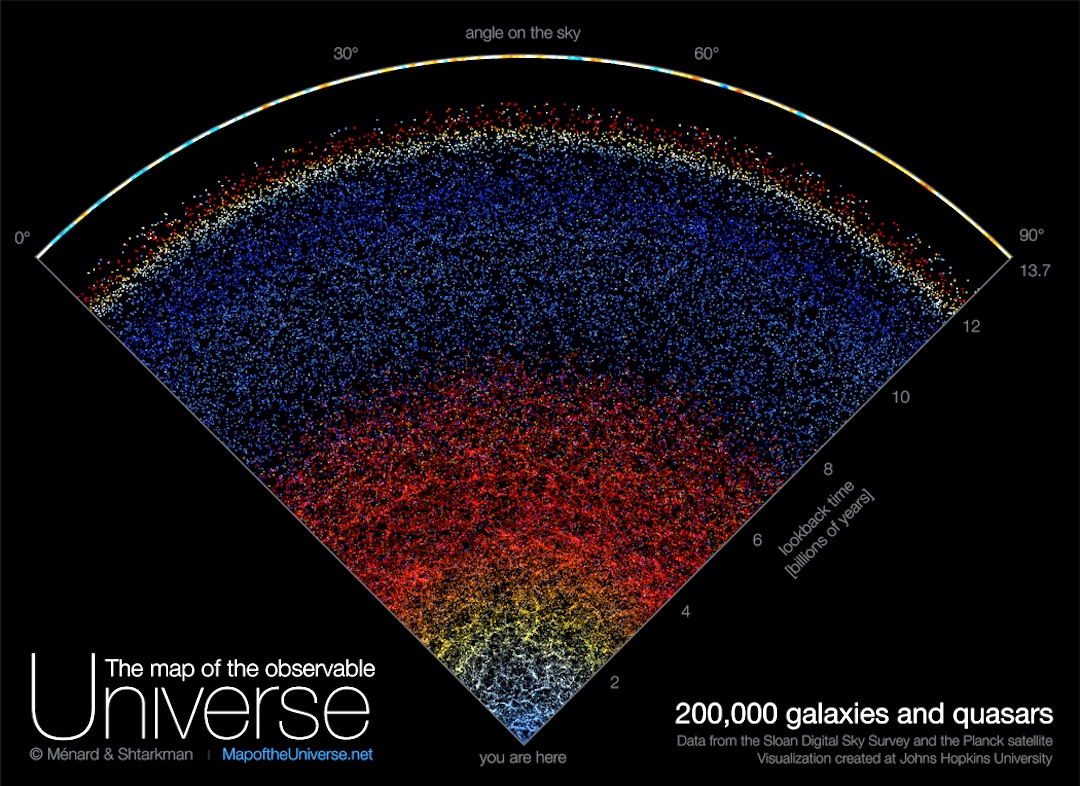
For the first time ever, researchers have compiled a map of the known universe comprising the entire span of its history.
Created by astronomers from Johns Hopkins University, the site uses two decades’ worth of data mined by the Sloan Digital Sky Survey, giving the public access to an accurate depiction of the cosmos once only available to scientists, and in an easy-to-understand view.
While clicking through the interactive map, users will get to see the actual position and real colors of 200,000 galaxies. Each dot represents an actual galaxy in our universe, in which are billions of stars and planets.
For example, The Milky Way, our very own galaxy, is only represented in the form of one of these spots—located at the bottom of the map. At the very top is the first flash of light emitted after the Big Bang, some 13.7 billion years ago.
Interestingly, users can scroll through a time-lapse of the expansion of the universe, from the most ancient galaxies to newly-formed ones. The farther an object is from the Earth, the redder it appears on the map.
“We are used to seeing astronomical pictures showing one galaxy here, one galaxy there, or perhaps a group of galaxies. But what this map shows is a very, very different scale,” explains Brice Ménard, a professor at Johns Hopkins.
He hopes the map’s awe-inspiring scale and beauty will serve as a reminder of the power of science, and that from just one speck at the bottom, humans have been able to map out galaxies across the entire universe.
Head here to try your hand at navigating the cosmos.
[via Gizmodo and Johns Hopkins University, cover image via B Ménard and N Shtarkman]


More Stories
Will County, Illinois 1864 Map – May 20, 2023 at 04:14AM
This kid on Google Map trying to get by – April 27, 2023 at 05:05PM
World of Hyatt: Complete list of all-inclusive properties in Europe (with map) – April 27, 2023 at 04:57PM