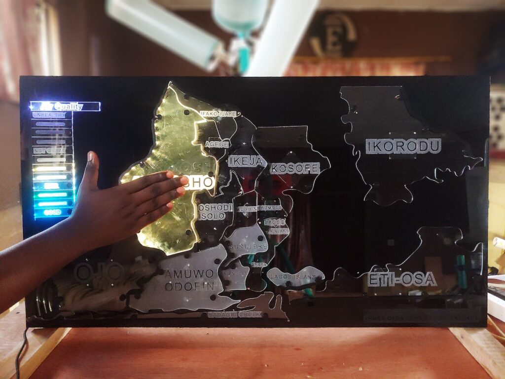

Writer Jason Pargin coined the term “Monkeysphere” to convey Dunbar’s number, which is the maximum number of stable relationships that a person can maintain. It is difficult for people to feel true empathy for anyone outside of their Monkeysphere, which is around 150 people. The result is that we often fail to give the proper attention to injustices that happen outside of our personal Monkeyspheres. To combat that tendency, Ahmed Oyenuga created the Interactive Air Quality Map.
If you live in the United States, the United Kingdom, or almost any other Western country, your air quality is probably pretty good. You might know on an intellectual level that many foreign countries and cities have serious issues with air pollution that cause real health problems. But those areas are far enough outside of your Monkeysphere that you have trouble caring about them. That isn’t a problem with you; it is simple human nature. Oyenuga’s air quality map provides striking visuals to hammer home the point, so that you get a tangible feel for the air quality in far away locales. It is one thing to read a statistic or look at a graph, but quite another to see the conditions in real-time with your own eyes.
That map consists of several regions cut out of clear acrylic and edge-lit with RGB LEDs. Most of the time, they shine with a pretty rainbow color that makes the map look like an art piece. But if someone touches a region or holds their hand nearby, that region lights up with a color that corresponds to its current air quality.

Air quality information is sometimes available through online service APIs, but that is less common in poor or rural areas. So Oyenuga built his own GPS-enabled air quality monitors using the DesignSpark Environmental Sensor Development Kit (ESDK). He hasn’t deployed those in many locations yet, but hopes to expand. An Arduino MKR WiFi 1010 uses that data to determine the light color for each region. A custom board based on an ATSAMD21J17 handles the capacitive sensing that detects when a user moves their hand near a region.
This map only shows the area around Lagos, Nigeria, but anyone can build a similar map that covers other areas or even the entire globe.
The post The interactive map highlights regional air pollution appeared first on Arduino Blog.


More Stories
Will County, Illinois 1864 Map – May 20, 2023 at 04:14AM
This kid on Google Map trying to get by – April 27, 2023 at 05:05PM
World of Hyatt: Complete list of all-inclusive properties in Europe (with map) – April 27, 2023 at 04:57PM