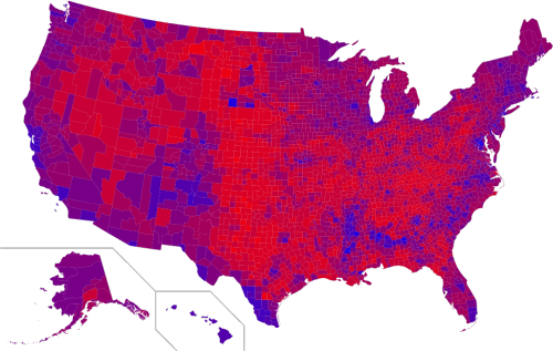

“Purple America” map of the 2016 Presidential Election: Rather than giving each county purely Red or Blue based on party victories, this map takes into account the margin of the vote in each county — The more purple the county, the narrower the margin, and the less divided America seems.
Purple America is the belief that a more detailed analysis of the voting results of recent United States national elections reveals that the U.S. electorate is not as polarized between “Red” America (Republican) and “Blue” America (Democratic) as is often depicted in news analysis.
Because the American political system often awards a state or congressional district entirely to one candidate (“winner take all”) without regard to the margin of victory, it results in a map that does not reflect the true distribution of “red” or “blue” votes across the nation. The distortions contained in these maps, the argument goes, contribute to the misperception that the electorate is highly polarized by geography.
Robert Vanderbei at Princeton University made the first Purple America map after the 2000 presidential election. It attempts to reflect the margin of victory in each county by coloring each with a shade between true blue and true red. In light of the general absence of overwhelming victories, this technique results in mostly shades.


More Stories
Will County, Illinois 1864 Map – May 20, 2023 at 04:14AM
This kid on Google Map trying to get by – April 27, 2023 at 05:05PM
World of Hyatt: Complete list of all-inclusive properties in Europe (with map) – April 27, 2023 at 04:57PM